Phantasus
What is Phantasus?
Phantasus is a web application for visual and interactive gene expression analysis. Phantasus is based on Morpheus – a web-based software for heatmap visualization and analysis, which was integrated with an R environment via OpenCPU API. Phantasus supports basic visualization such as heatmaps, filtering methods, R-based methods such as k-means clustering, principal component analysis, and differential expression analysis with the limma package. Detailed documentation of the Phantasus application can be accessed here.
How does Phantasus help in data analysis?
Phantasus takes GCT (Gene Cluster Text) file format as input and generates a heatmap for these genes corresponding to a certain condition or parameter like cell type, cell line, etc. that are listed in the metadata. Then, it converts them into useful visualizations which makes it easier to analyze and draw conclusions. Using this tool, users can easily analyze the gene data, differentiate between them, and find the group of genes that matches our study interest. Various statistics and differential expression techniques are used to find the difference between the genes.
- Loading public datasets from Gene Expression Omnibus with both microarrays and RNA-seq datasets being supported.
- Differential gene expression using limma or DESeq2.
- Publication-ready plots with export to SVG: PCA plot, row profiles, box plots, volcano plots.
- Clustering: k-means and hierarchical.
- Gene set enrichment analysis.
- Pathway enrichment analysis using EnrichR.
Phantasus on Polly
OmixAtlas on Polly is a data warehouse of millions of datasets from public, proprietary, and licensed sources. Phantasus can be accessed directly from Polly OmixAtlas. The curated datasets available on the OmixAtlas allow seamless integration of the Phantasus app and analysis of data without the need for preprocessing.
Phantasus user journey through Polly OmixAtlas
Find relevant datasets
Users can find relevant datasets using the powerful search bar on the OmixAtlas homepage. Salient features of the search bar are -
- The search bar is driven by Elasticsearch which allows users to search with keywords and long queries.
- The keywords are present across source metadata (title, description, and study design) and curated metadata (cell type, cell line, tissue, drug, etc.).
- It allows fuzzy search, for example, if users search for 'transcriptomics', it will show results for 'transcript' and 'transcriptome' as well.
- There are operators such as 'exact', 'and', 'or', 'not', and 'group' for better search.
Other than the search bar, users can filter the datasets using configurable filters. A detailed description of how to find datasets can be found here.
Starting Phantasus
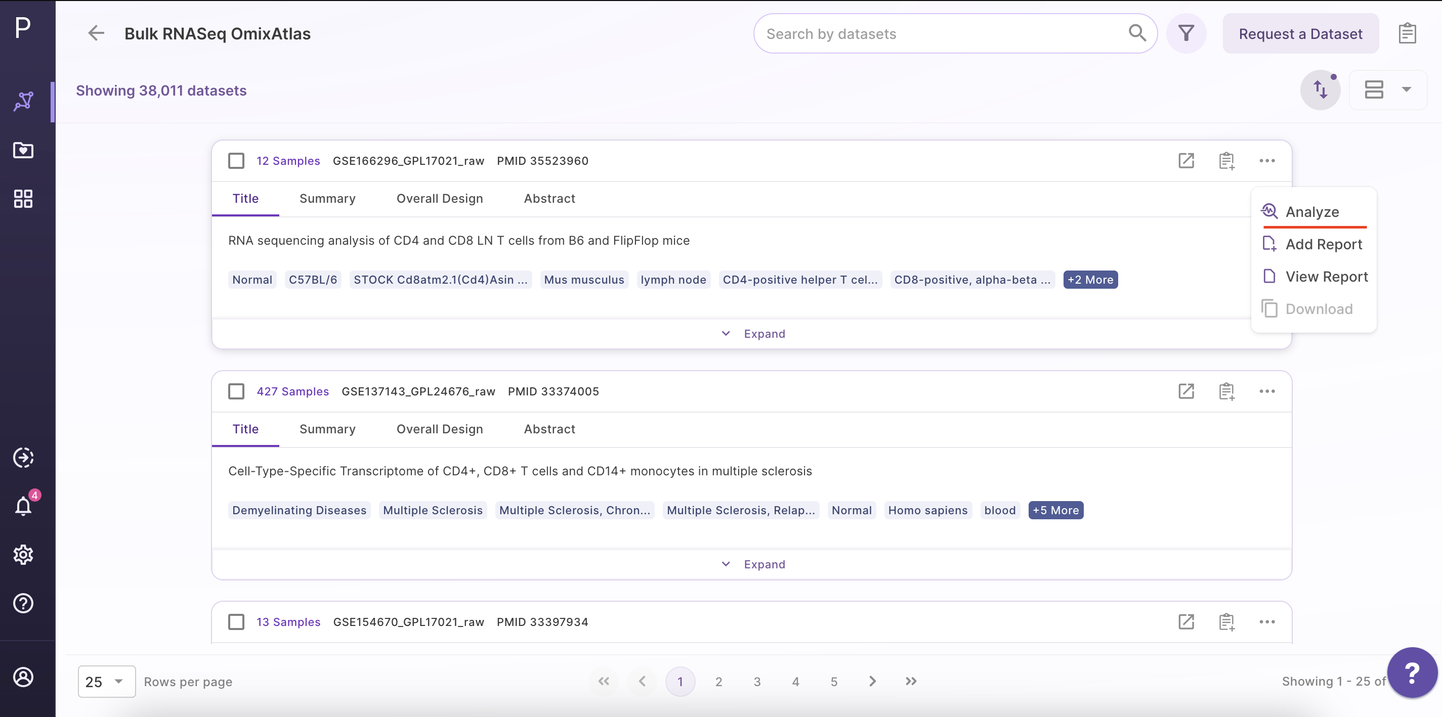
Step 1 - Selection of dataset of interest
Select the dataset of interest, click on 'Options', and then click on 'Analyze'.
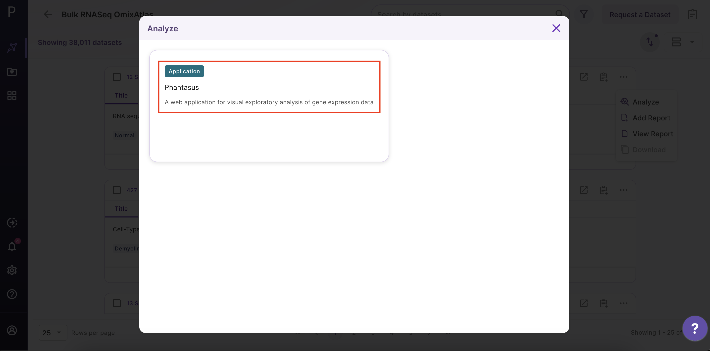
Step 2 - Open the Phantasus application
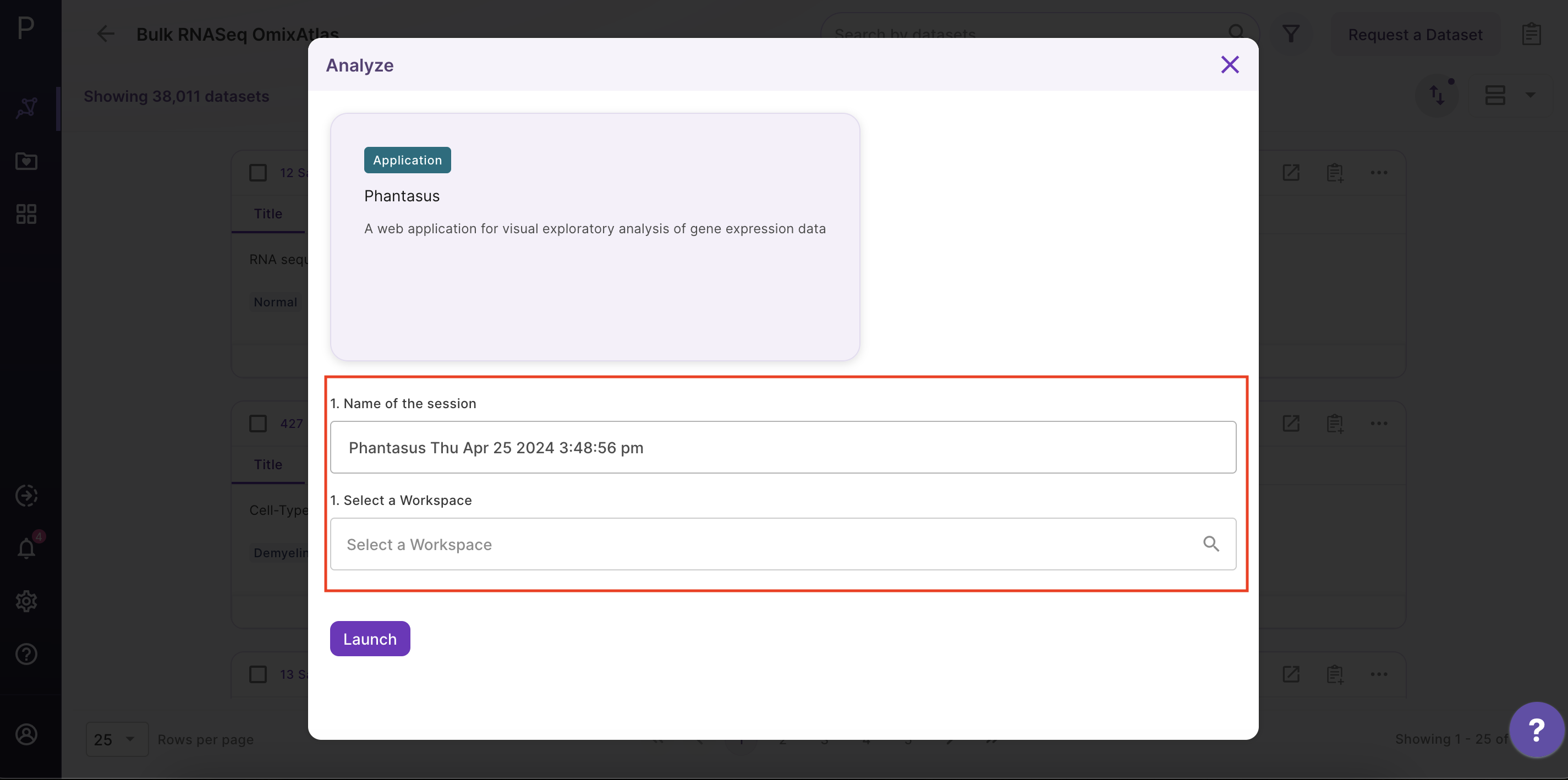
After clicking 'Analyze', a side window opens up. Select 'Phantasus' application and fill in the details about the name and workspace where the analysis is to be saved.
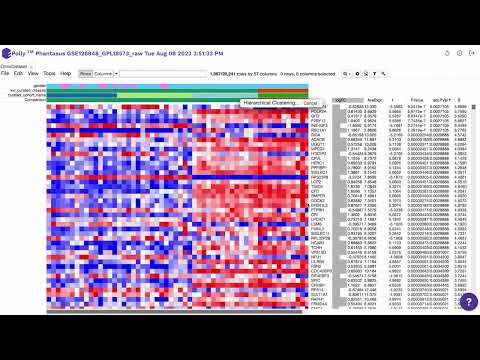
Phantasus Dashboard
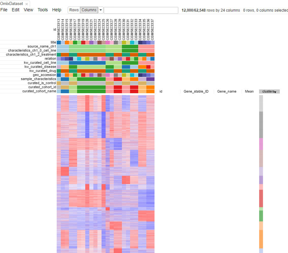
Preparing the dataset for analysis
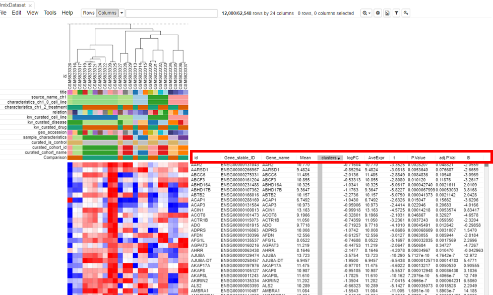
As shown in the above figure, rows on the heatmap correspond to genes. The columns correspond to samples which are annotated titles, GEO sample accession identifiers, and custom curated fields which are annotated when each dataset is ingested into Polly.
Adjusting expression values
Adjusting expression values to the log scale is an essential step in the analysis that helps in the normalization of the data. Raw data on OmixAtlas has gene counts that are not normalized. Data imported from OmixAtlas is normalized by default on Phantasus. Data is normalized using Variance Stabilization Transformation (VST) method. VST aims to generate a matrix of values for which variance is constant across the range of mean values, especially for low mean.
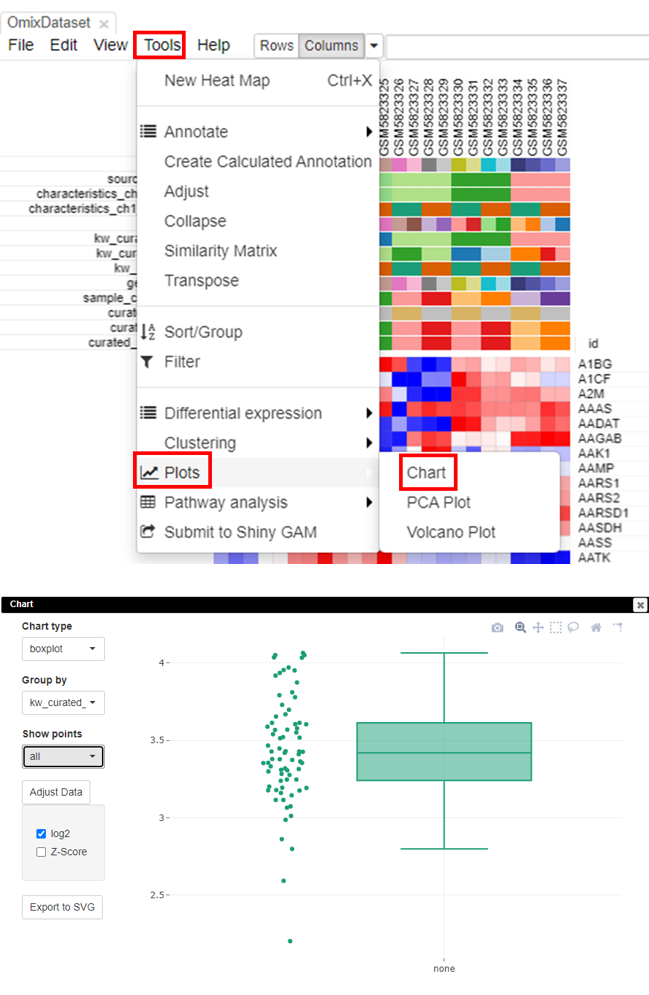
Checking scale through box plots
The most accurate way to check if the data is scaled to log2 is via box-plots. To plot this, click on Tools/Plots/Chart. Adjust the parameters to get a box plot.
Filtering lowly-expressed genes
Filtering genes that have low expression is a critical step as it helps in the reduction of noise in the data and increases the probability of finding the set of genes that are significantly different in case versus control.
To filter the genes, the first step is to calculate the mean expression of each gene. To do this, click on Tools/Create Calculated Annotation.
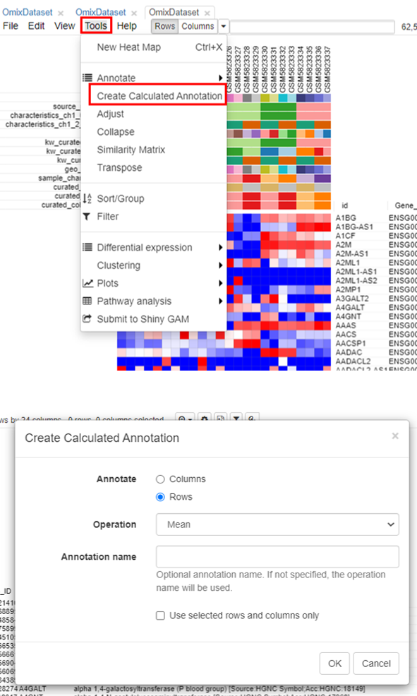
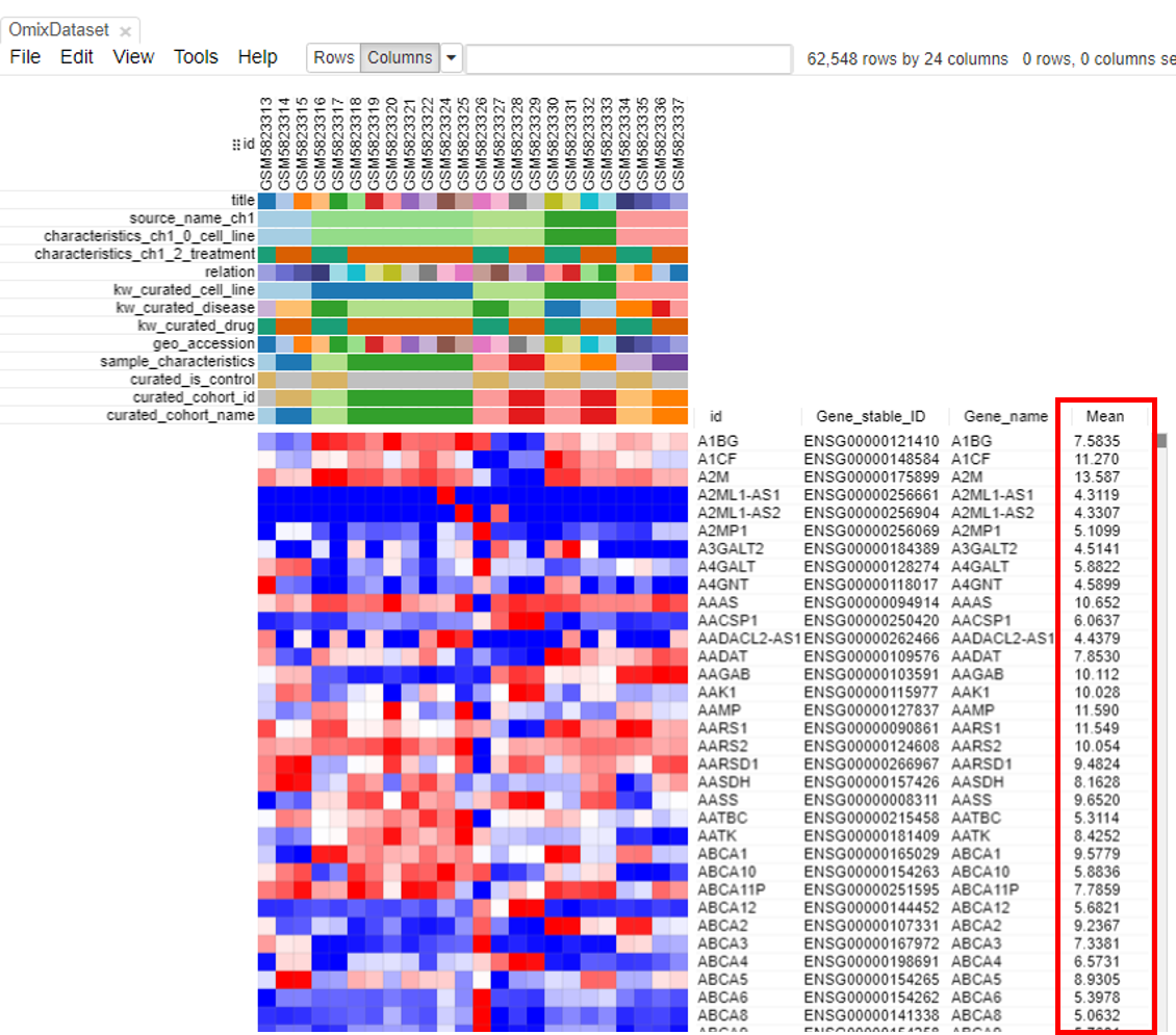
A column containing the 'Mean' will appear.
The second step is to filter genes. To do this, click on Tools/Filter.
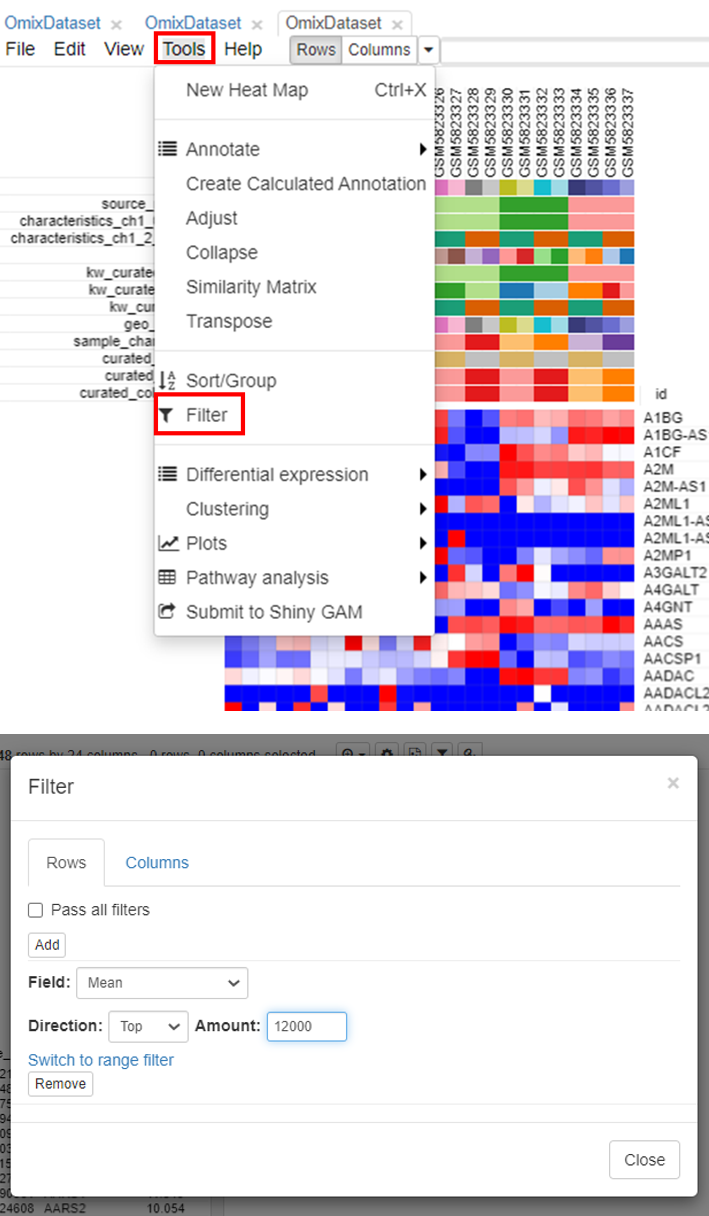
Users can choose the range depending on the analysis. It is common practice to choose 10,000 to 12,000 genes for most mammalian datasets.
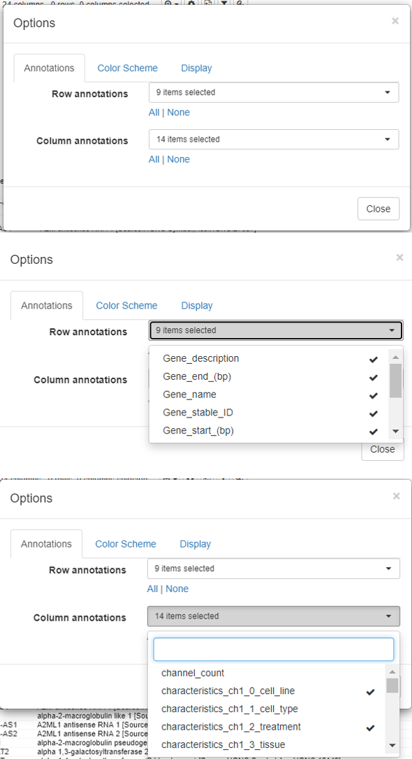
Modify the row/column annotations
The rows and columns on a dataset could be overwhelming for the user to perform downstream analysis.
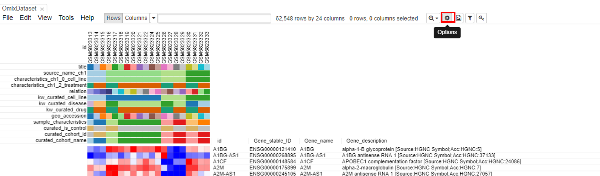
To modify the row and column headers, click on Options/Annotations and select/deselect the rows/columns of interest.
Exploring the dataset
PCA plot
PCA plots are the most popular way to analyze the RNA seq datasets. To do so, click on Tools/Plots/PCA plot.
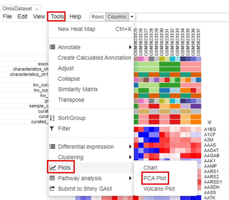
The plot is generated instantly.
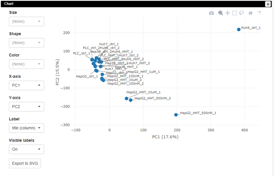
The PCA plot is customizable. Users can change the colors, sizes, and labels of points on the plot.
K-means clustering
Clustering the datasets is useful in interpretation of the data. To do this, click on Tools/Clustering/K-means.
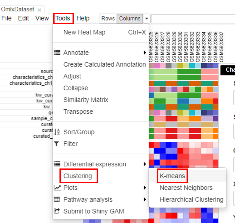
Another column with color-coded clusters will appear in the table.
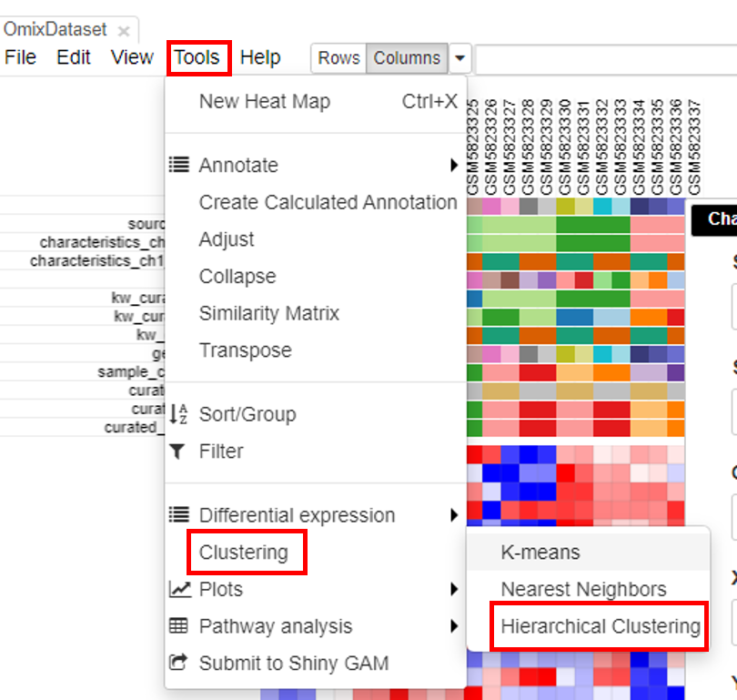
Hierarchical clustering
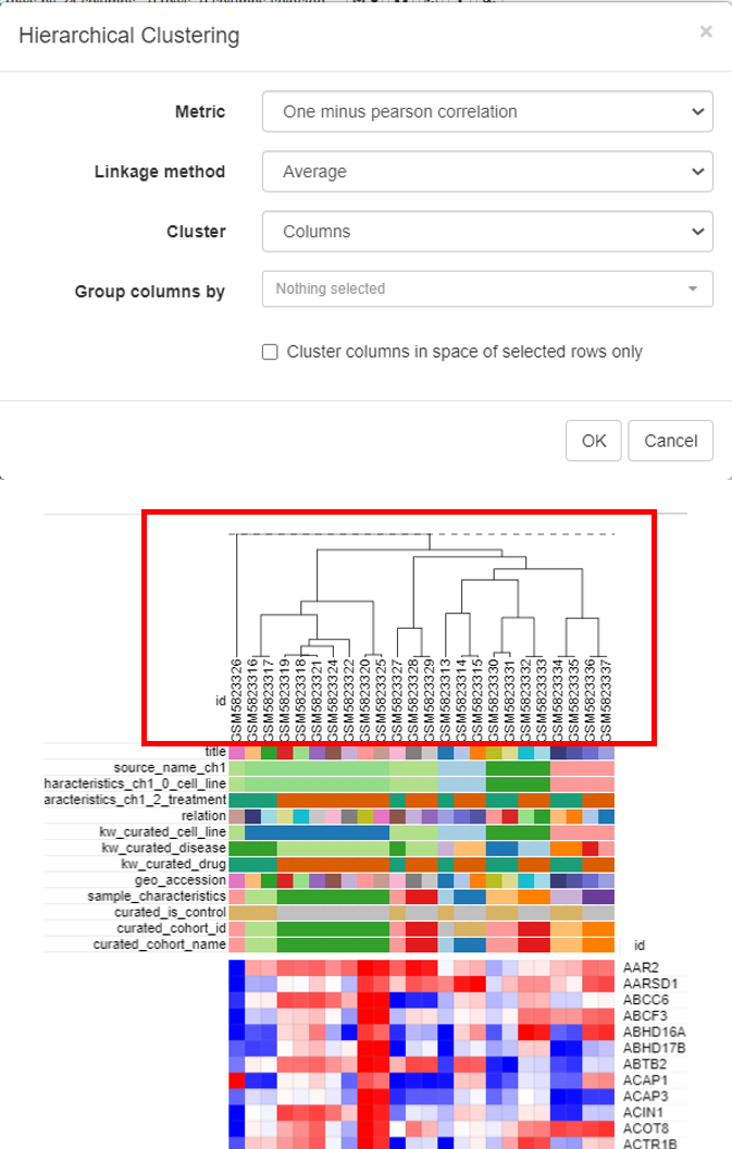
Hierarchical clustering is done to cluster samples and highlight the outliers. To do this, click on Tools/Clustering/Hierarchial Clustering.
Clusters will appear on top of the columns of the heatmap.
Differential gene expression
Differential gene expression is the final step in the analysis to shortlist the genes that are differentially expressed in case versus control.
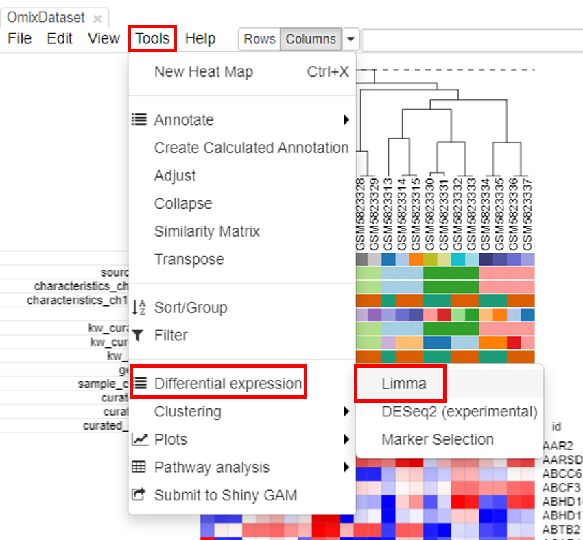
Applying limma tool
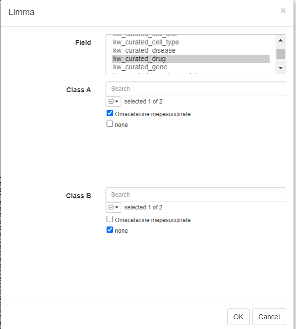
Limma tool can be used to carry out the differential gene expression. To do this, click on Tools/Differential expression/Limma.
Select the row metadata as field. For example, the curated drug can be chosen as field, with drug and none as classes.
Log fold change and p-value appears in the table.
Volcano plot
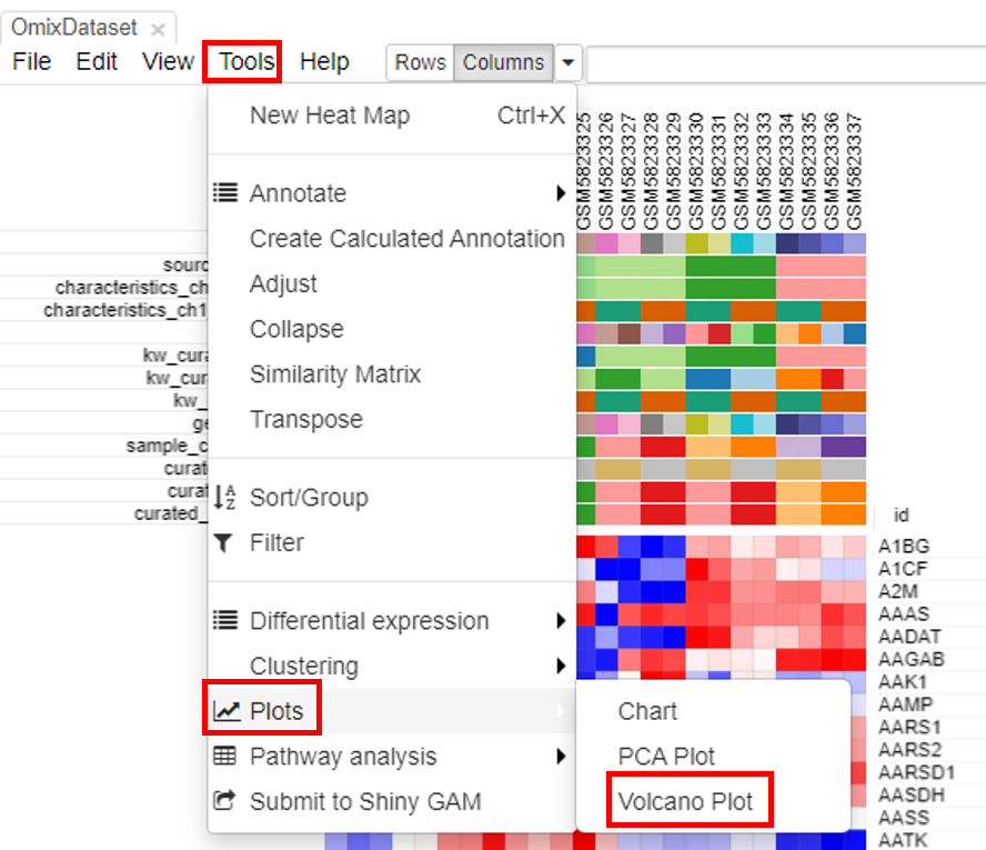
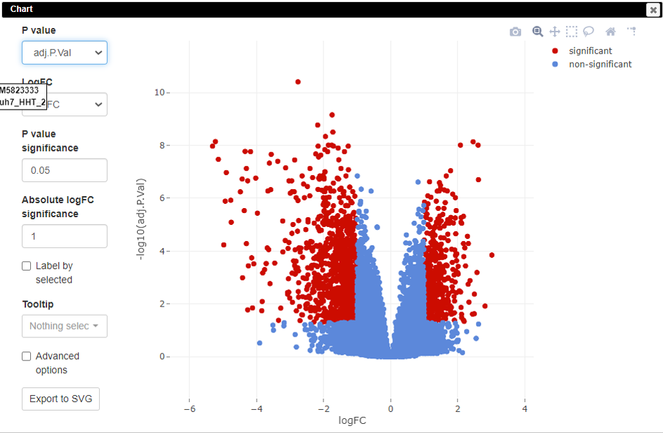
Volcano plots are an important visualization tool that gives a quick glance at the statistically significant differentially expressed genes. To create a volcano plot, click on Tools/Plots/Volcano Plot.
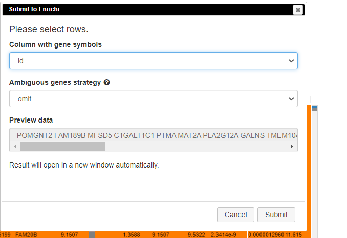
Pathway analysis
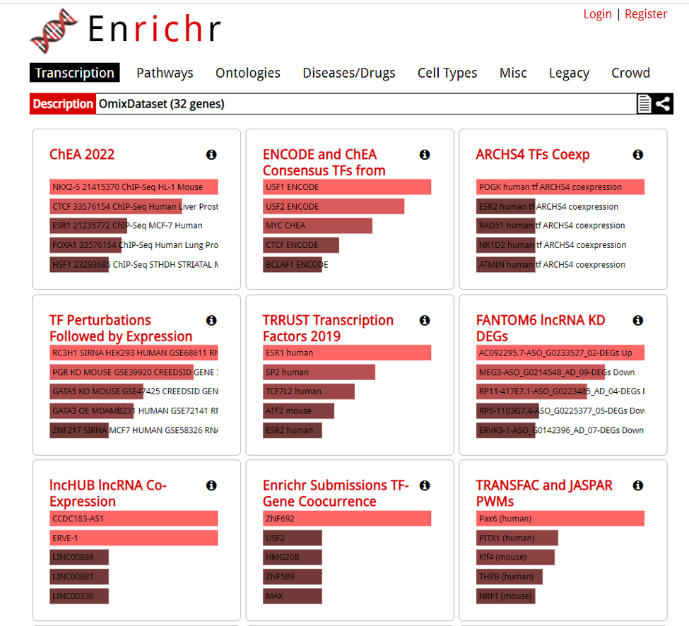
Pathway analysis is done to understand the biological processes that are differentially involved in case versus control. To do this, select the rows and click on Tools/Pathway analysis/Enrichr.
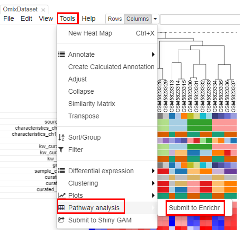
A new tab will appear with the results.
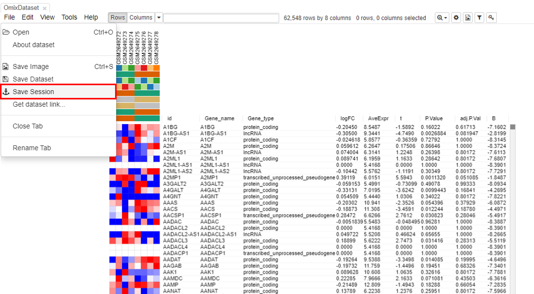
Downloading DE analaysis
Users can download the DE analysis from Phantasus accessed in the destination atlas. The file will be downloaded in the GCT format. To do this, select File/Save Session. This feature is not available in the source atlas.
Video
Reference:
Kleverov, M., Zenkova, D., Kamenev, V., Sablina, M., Artyomov, M., & Sergushichev, A. (2022). Phantasus: web-application for visual and interactive gene expression analysis. bioRxiv, 2022-12.
DOI: https://doi.org/10.1101/2022.12.10.519861
Published date - December 12, 2022.