Gene Spotlight Analysis
Introduction
Overview
Differential gene expression helps us in investigating the biological differences between a diseased and healthy state and understand the pathology of diseases. In clinical and pharmacological research, differentially expressed genes could be valuable to pinpoint candidate biomarkers, therapeutic targets, and gene signatures for diagnostics. A gene-centric approach to query for datasets would enable the researcher to make a qualitative judgment of the dataset(s) of interest, thereby eliminating the need to individually run multiple datasets to narrowed down to the required one(s).
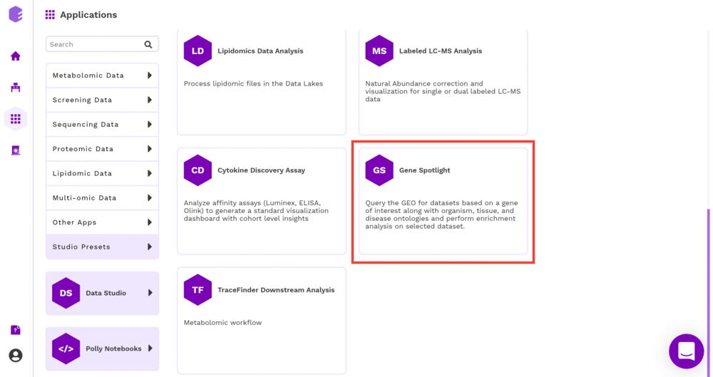
Gene Spotlight Analysis allows you to query the Gene Expression Omnibus (GEO) for datasets based on a gene of interest along with organism, tissue, and disease ontologies and perform enrichment analysis on the selected dataset.
Scope of the Preset
- Query datasets based on the input gene, and study-level ontologies such as tissue, disease, and organism
- Perform quality checks using Principal Component Analysis (PCA)
- Perform statistical analysis using limma and t-test and provide interactive visualizations
- Understand which genes are most suitable for suppressing or exciting a process.
- Performs the enrichment analysis on the gene set relayed.
Getting Started
User Input
- Ontology Mapping File This file has the study-level metadata identifiers as present in the GEO Data Repository on Polly required to perform the gene query. Note: This file will be provided by the team, and you can upload it from your workspace to the analysis.
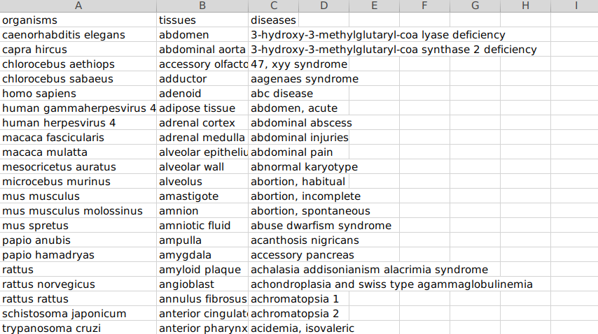
Sample Ontology File
- File format accepted: .csv
- Data Format: The dataset comprises three columns -
- Organism,
- Tissues, and
- Diseases
Tutorial
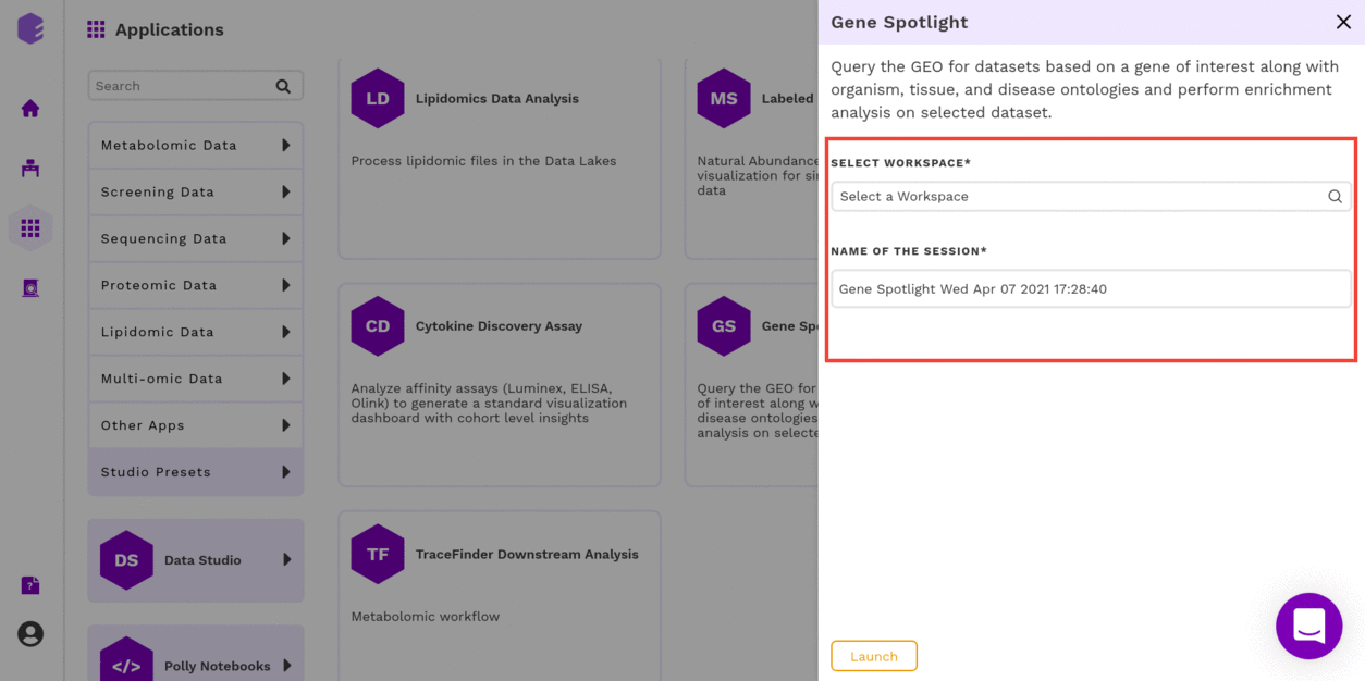
Select Gene Spotlight Preset from the dashboard under the Studio Presets tab.
Select an existing Workspace from the drop-down and provide the Name of the Session to be redirected to Gene Spotlight Preset's upload page.
GEO Dataset Search
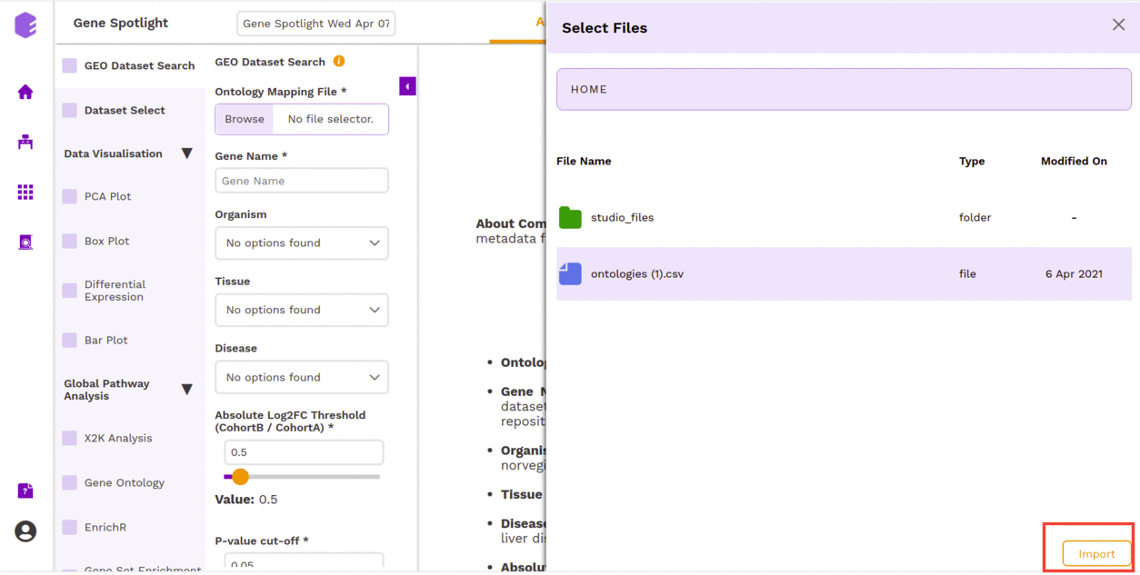
The first component is the GEO Dataset Search component which allows you to upload the Ontology Mapping file and the query fields required for processing through the preset.
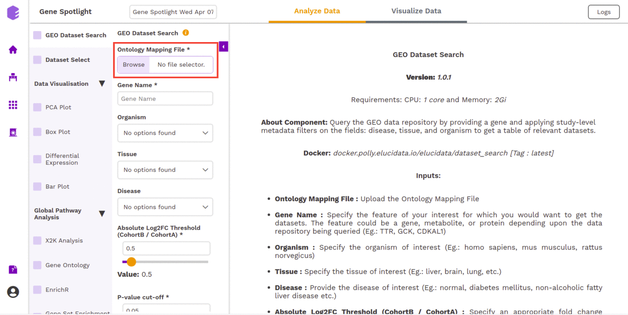
To upload the input files, Click on Browse, which will open a sliding menu containing the data files in the selected workspace. Select the desired file and click on Import.
The component allows us to search the datasets based on the following responses.
- Gene Name: Dropdown to select a gene name from the ontology mapping file.
- Organism: Dropdown to select an organism name from the ontology mapping file.
- Tissue: Dropdown to select a tissue name from the ontology mapping file.
- Disease: Dropdown to select a disease name from the ontology mapping file.
- Absolute Log2FC Threshold: You can select the appropriate fold change threshold. Log2fold change values higher than this will be marked as significant.
- P-value cut-off: You can select the appropriate threshold for the selected p-value metric. p-values lower than this threshold will be marked as significant.
Once the file is imported and all the parameters are filled, click on Run Task to execute the component.
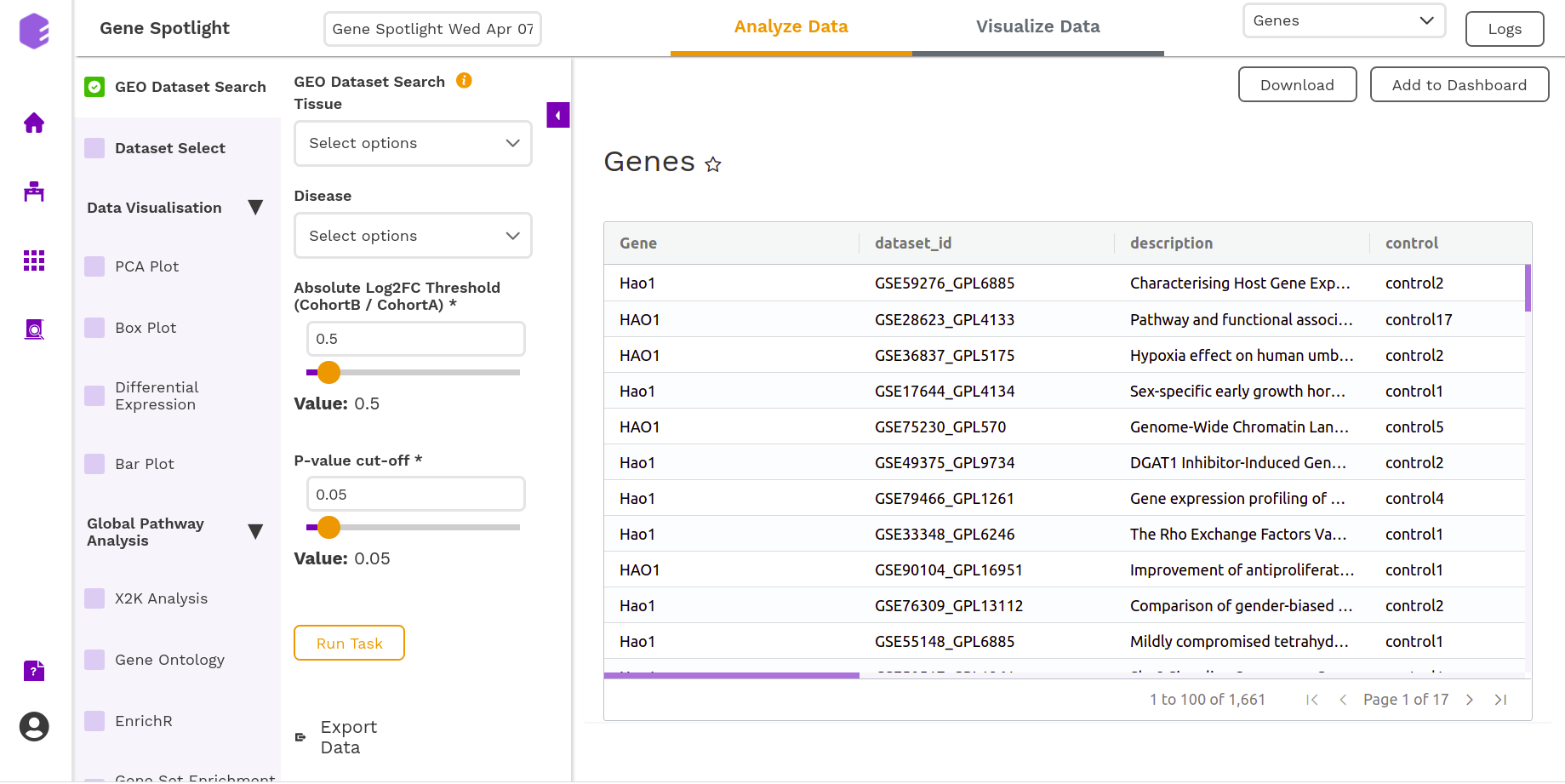
It will generate a table of the relevant datasets narrowed down based on the metadata filters and the gene of interest with their corresponding log2FC and p-value.
Dataset Select
You can select the dataset of your interest in this section of the component. The inputs required are -
- Select Dataset: Based on your ontology choices, you will get a list of datasets corresponding to the inputs of your interest. You can select a dataset and execute the component.
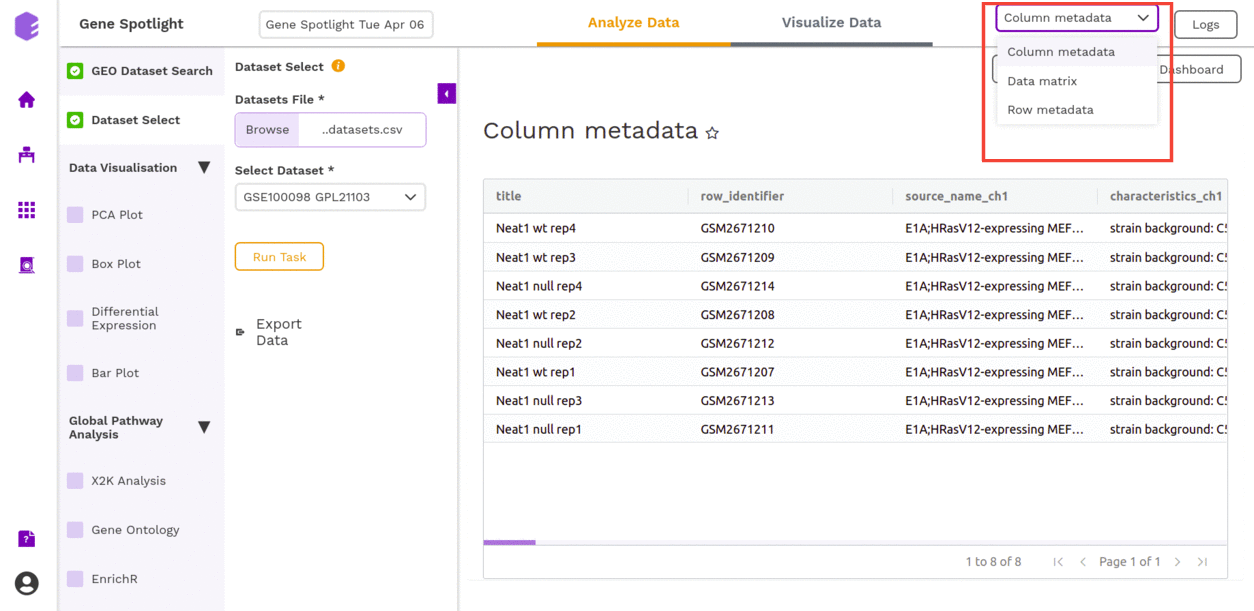
It will generate the following files:
- Column metadata: Table for the metadata information associated with each sample. Rows represent samples and columns represent various attributes of each sample.
- Data matrix: The rows represent different genes while the columns represent the various samples from whom data was collected. The entries are expressions of each protein.
- Row metadata: Table for the metadata information associated with each gene. Rows represent genes and columns represent various attributes of each gene.
Data Visualization
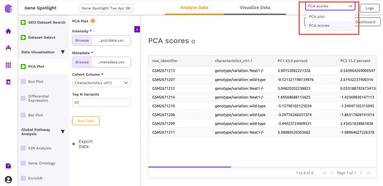
PCA Plot
This component allows you to simplify the complexity of high-dimensional data while retaining the trends and patterns in it. It projects the data onto a lower dimension with an objective to find the best summary of the data using a limited number of principal components that help in understanding the clustering pattern between biologically grouped and ungrouped samples.
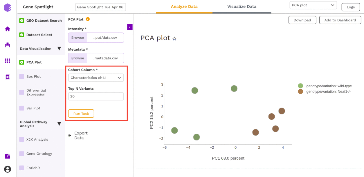
- Cohort Column: Dropdown to select one of the metadata columns.
- Top N Variants: The top N variable entities will be used for PCA calculation. Define the number in this box.
It generates two outputs:
- PCA Plot: A plot is created where the samples are labeled based on the cohort selected in the metadata column. When you hover over the points, sample ID and percentage of variance explained by each principal component are displayed along with the cohort.
- PCA Score: Table of the first 10 PC values and metadata columns.
Box Plot
A boxplot is a visualization component to display the distribution of data based on quartiles. Outliers are also displayed as individual points. It uses a five-number summary (minimum, first quartile, median, third quartile, and maximum) to display the distribution.
This component takes the following inputs-
- Data matrix: This file consists of expression values with genes in rows and samples in columns.
- Metadata: This file pertains to the sample level metadata. Rows represent samples and columns represent various attributes of the samples.
- Select gene/metabolite: Dropdown for picking the gene for which the boxplot is to be made.
- Select metadata column: Dropdown to select one of the metadata columns.
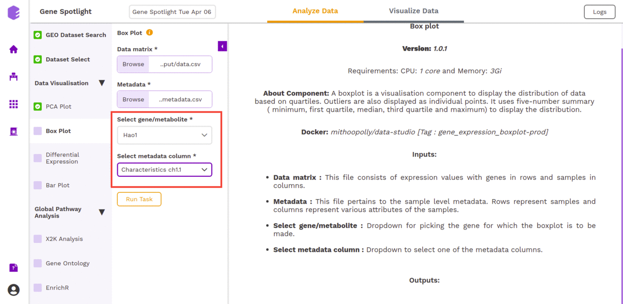
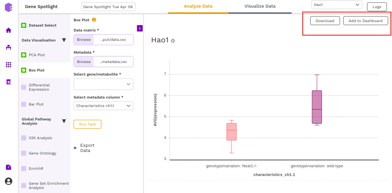
After executing the component, an interactive Boxplot will be generated as an output for the selected gene.
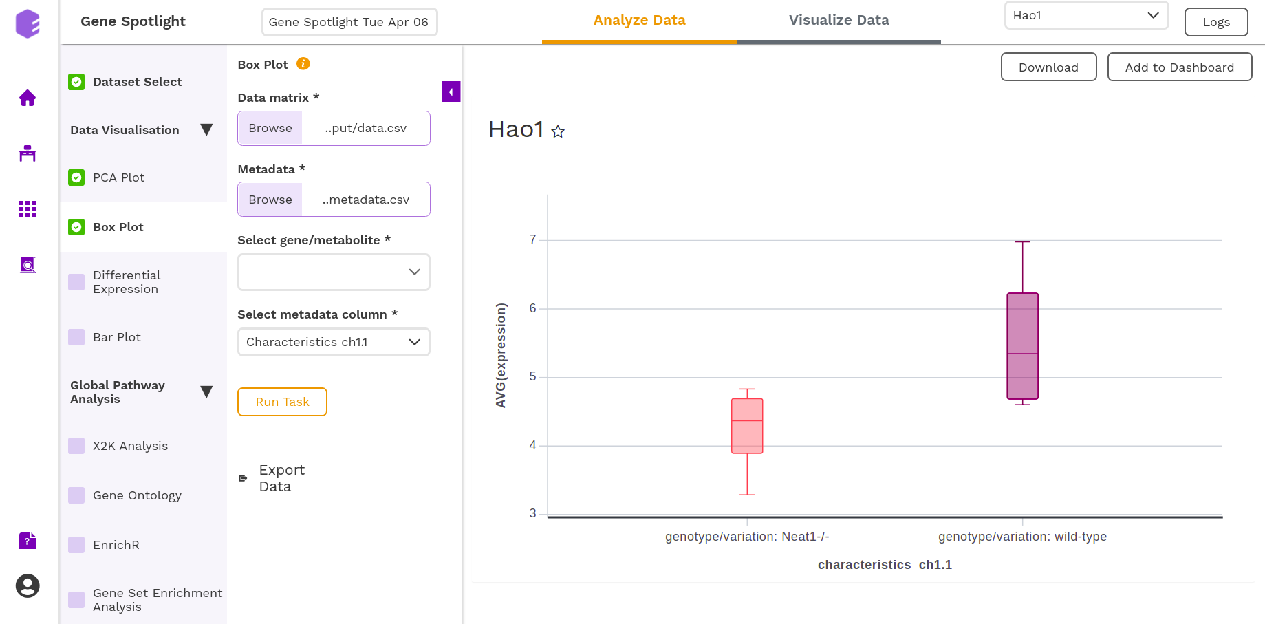
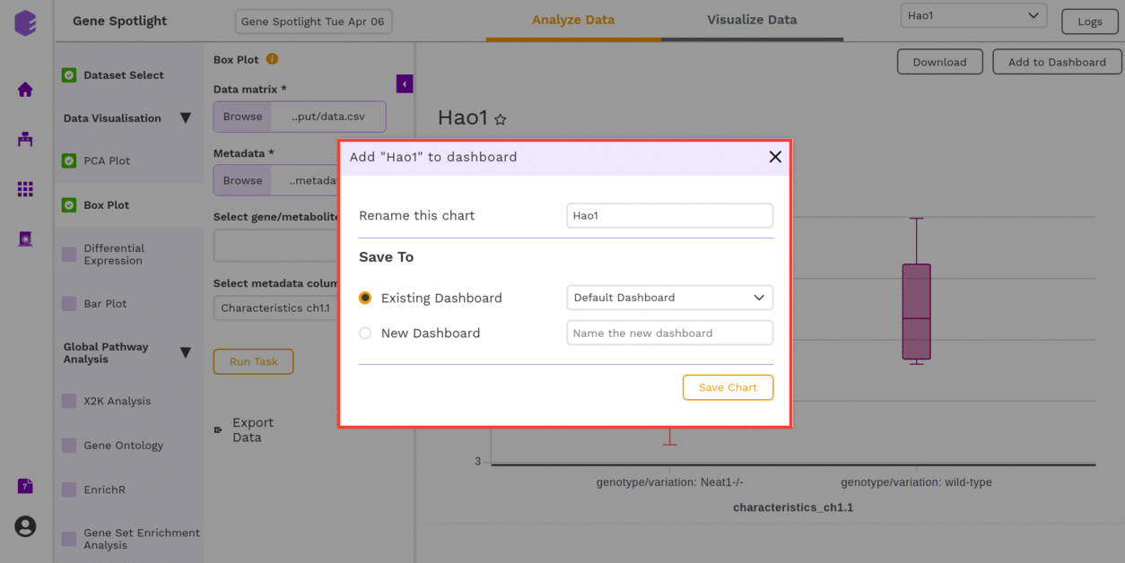
You can download the figures and save the images to the dashboard.
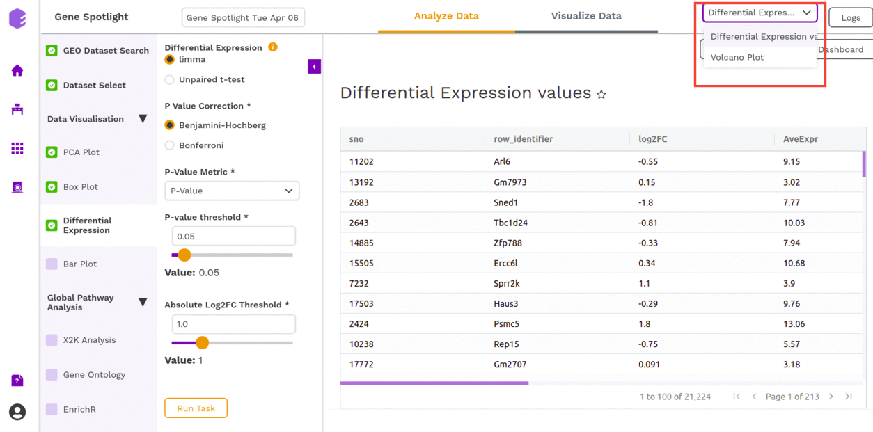
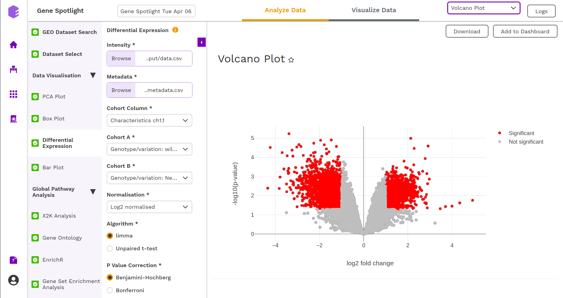
Differential Expression
The most common use of transcriptome profiling is in the search for differentially expressed (DE) genes, that is, genes that show differences in expression level between conditions or in other ways are associated with given predictors or responses.
- Cohort Column: Dropdown to select one of the metadata columns.
- Cohort A: Dropdown to select a cohort from the metadata column selected.
- Cohort B: Dropdown to select another cohort from the metadata column selected.
- Normalization: Perform log2 normalization if data is not normalized.
- Algorithm: You can select any one of the two algorithms limma or Unpaired t-test.
Limma is an R package for the analysis of gene expression microarray data, especially the use of linear models for analyzing designed experiments and the assessment of differential expression. Limma provides the ability to analyze comparisons between many RNA targets simultaneously in arbitrary complicated designed experiments.
An unpaired t-test (also known as an independent t-test) is a statistical procedure that compares the averages/means of two independent or unrelated groups to determine if there is a significant difference between the two.
- P-Value Correction: You can select the Benjamini-Hochberg method to correct the p-value for False Discovery Rate or the Bonferroni method to correct the p-value for Type I errors.
- P-Value Metric: Plot and calculate significance using the selected metric. The p-value is the value returned by the algorithm while the Adjusted p-value is the corrected value after applying one of the correction methods above.
- P-value threshold: You can select the appropriate threshold for the selected p-value metric. p-values lower than this threshold will be marked as significant.
- Absolute Log2FC Threshold: You can select the appropriate fold change threshold. Log2fold change values higher than this will be marked as significant.
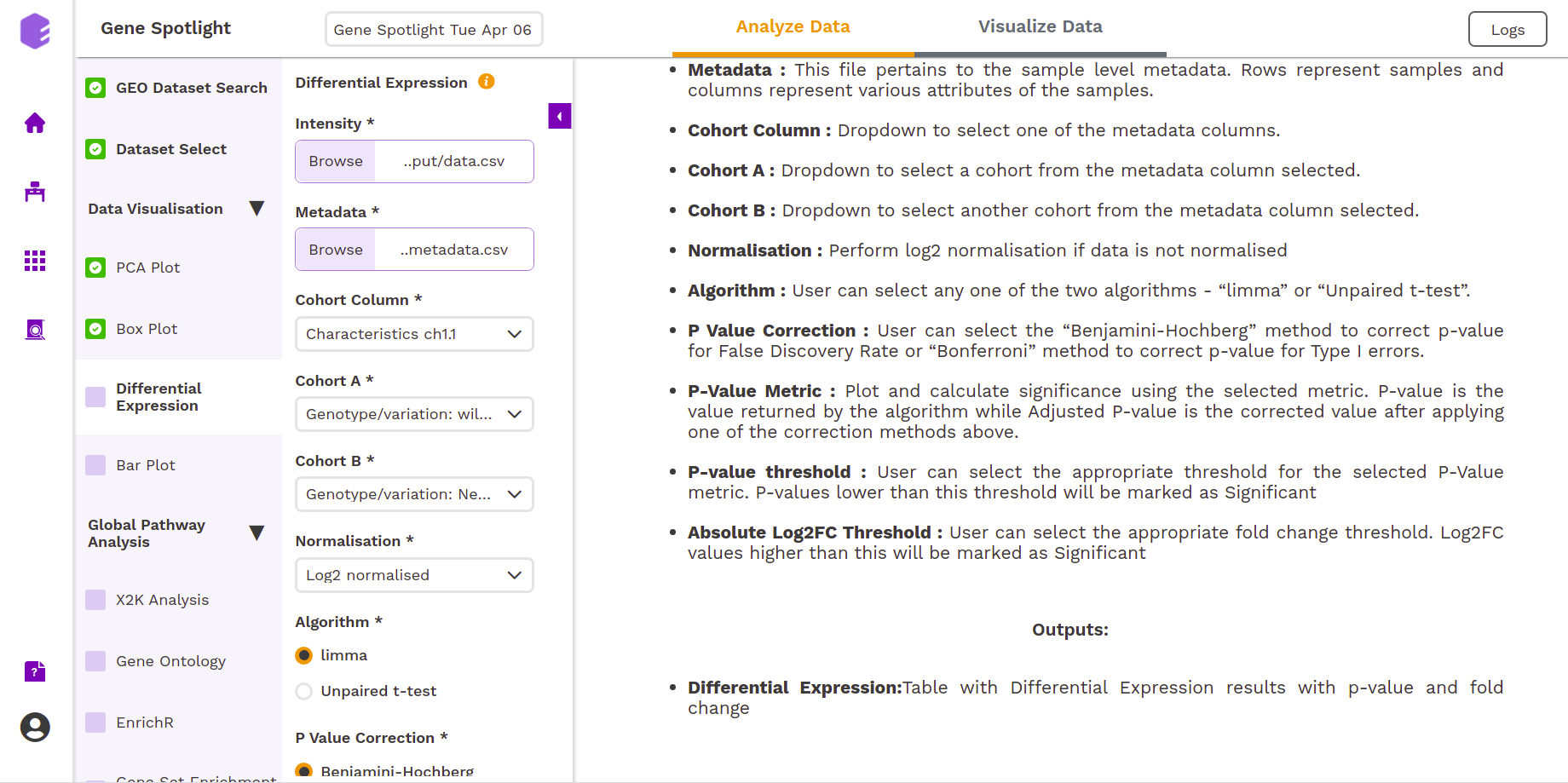
Once all the parameters are selected, execute the component by clicking on Run Task. It will generate two outputs:
- Differential Expression: Table with Differential Expression results with p-value and fold change.
- Volcano Plot: Based on the parameters specified, a volcano plot is displayed. The volcano plot helps in visualizing metabolites that are significantly dysregulated between two cohorts.
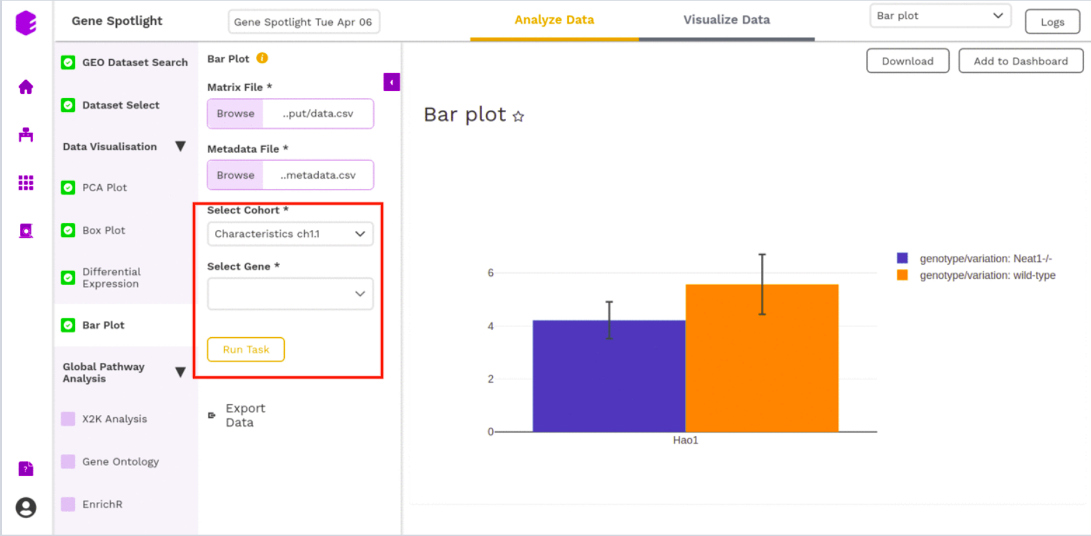
Bar Plot
The Bar plot is able to give you a count of the different genes (Select Gene) based on a particular way of separating out the samples (Select Cohort).
- Cohort: Dropdown to select one of the metadata columns.
- Gene: Select one of the Genes to get a count on the basis of each cohort type
After executing the component, an interactive Bar Plot will be generated as an output.
Global Pathway Analysis
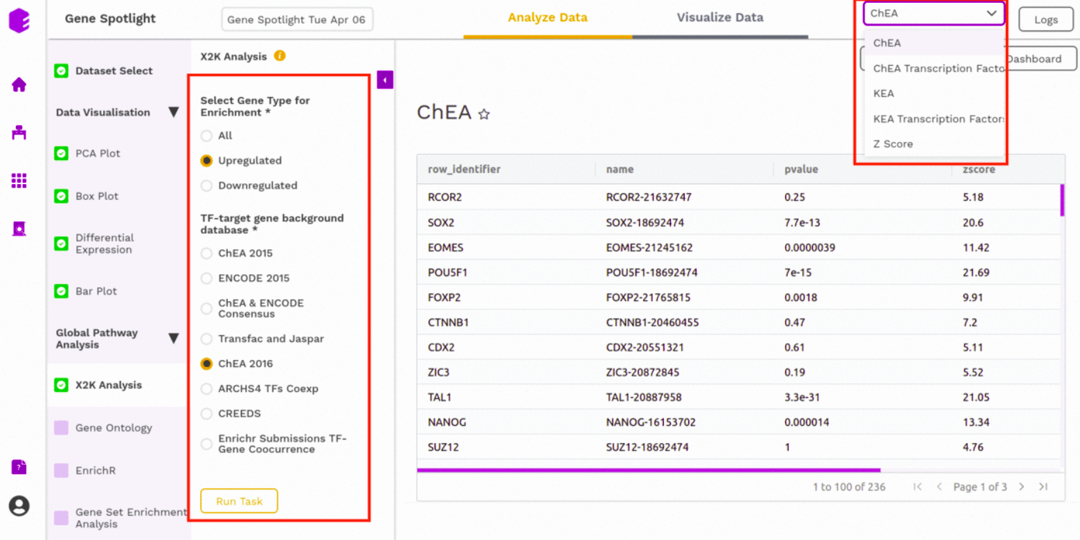
X2K analysis (eXpression2Kinases)
An X2K analysis involves measuring transcription factors regulating differentially expressed genes which further associates it to PPIs or Protein-Protein interactions thereby creating a subnetwork. A Kinase Enrichment analysis is done on the nodes of this subnetwork.
The X2K analysis is done after the differential expression is carried out. The differentially expressed data is used as an input for X2K analysis. Here, the differential expression is performed where significant genes (p-value < 0.05) are selected. These significant genes are ordered on the basis of their log2FC value. You can select the top 'n' of the ordered values based on the up and downregulation of genes.
You can choose from the following databases to perform the analysis.
- ChEA 2015
- ENCODE 2015
- ChEA & ENCODE Consensus
- Transfac and Jaspar
- ChEA 2016
- ARCHS4 TFs Coexp
- CREEDS
- Enrichr Submissions TF-Gene co-occurrence
On selecting all the options along with the target database, click on the option Run Task.
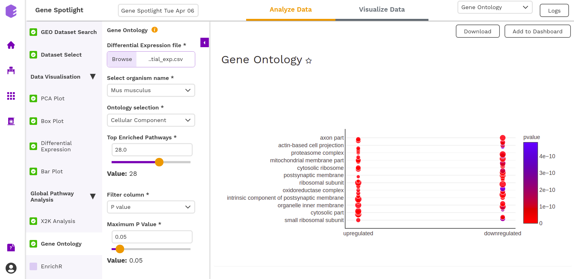
Gene Ontology
Gene Ontology allows us to find out the set of genes that influences a particular process.
One of the previous outputs: Differential Expressions, allows us to understand the effect of a particular stimulus (a drug, in this case) on genes. Some genes may get excited (higher expression or Upregulated) or may get repressed (lower expression or Downregulated). Apart from the altered expression due to the stimulus, you also have expression data for the genes under normal conditions. So, the Differential Expression is able to capture the log-fold change in expression of each gene.
Now, genes play a role in different avenues of an organism. You can select the organism from under the Select organism name. The two types that are available are:
- Homo sapiens,
- Mus musculus
The roles are found under Ontology Selection. Under Ontology Selection, you have the following choices:
- enrichKEGG,
- Molecular Function,
- Biological Process (things like hair-growth), and
- Cellular Components (effects on different cellular components)
Top Enrichment Pathways are the set of the top 'n' genes (based on an internal scoring) of the overall effect that gene played in a Process: the top gene was the one whose shutting-down would be most detrimental to a process (maybe because it just so happens that the functions controlled by that gene do not overlap with any other genes functions).
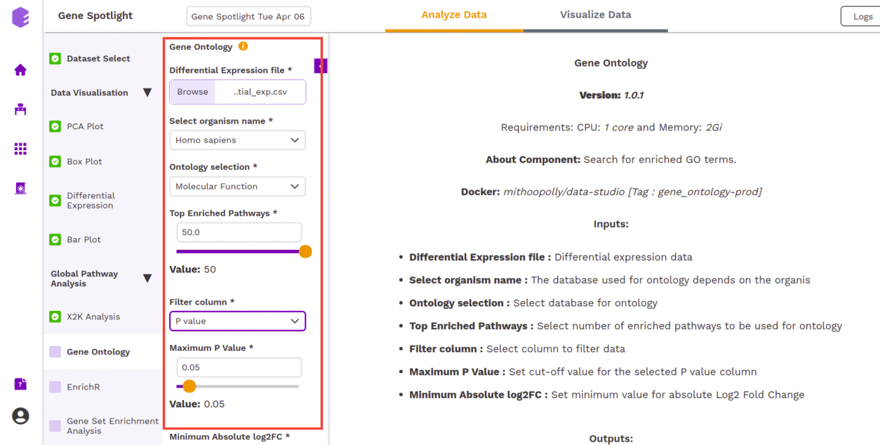
On providing the required parameters, you get the following output-
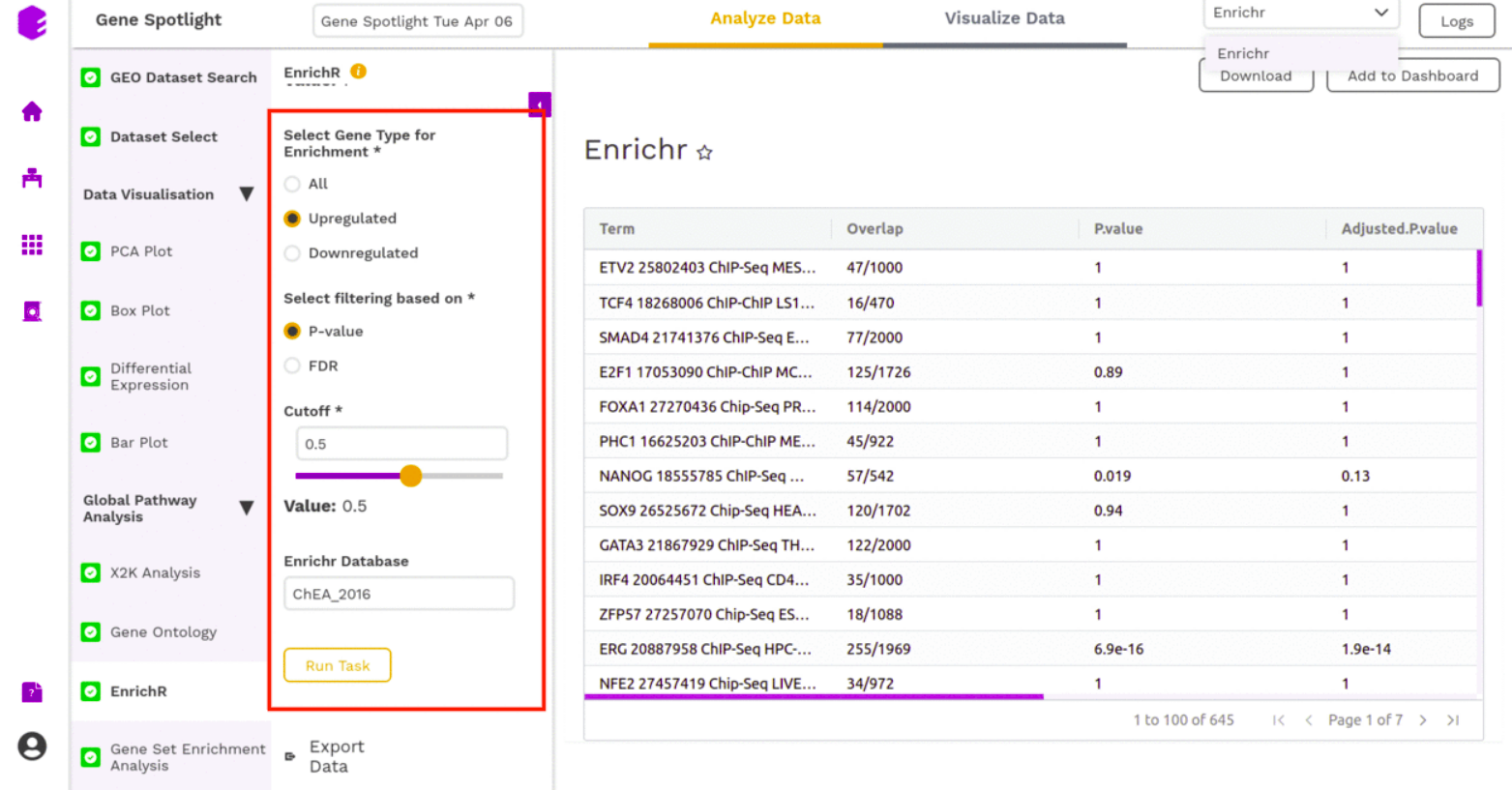
EnrichR
EnrichR performs the enrichment analysis on the gene set relayed, either in the Differential Expression tab or X2K analysis tab. Enrichment analysis is a computational method for inferring knowledge about an input gene set by comparing it to annotated gene sets representing prior biological knowledge. Enrichment analysis checks whether an input set of genes significantly overlaps with annotated gene sets.
To perform the enrichment analysis, select the desired EnrichR database from here and enter its name in the field.
The component will generate the following output-
Gene Set Enrichment Analysis
Gene Set Enrichment Analysis (GSEA) is a computational method that determines whether an a priori defined set of genes shows statistically significant, concordant differences between two biological states (e.g. phenotypes).
- Differential Output File: Select the differential expression output file with the row IDs, log2 fold change, p-value, and adjusted p-value (FDR correction or Bonferroni)
- Organism: Select the organism for which the differential expression was performed. This information is used to select the database for enrichment calculation.
- P-value threshold: Set a cut-off for p-value. Entities with a higher p-value than the selected cut-off will be dropped from enrichment calculation.
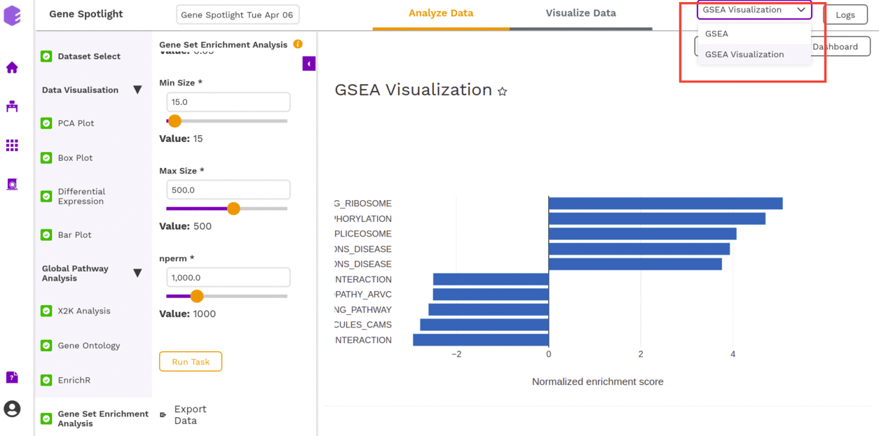
- Min Size: Minimal size of a gene set to test. All pathways below the threshold are excluded.
- Max Size: Maximal size of a gene set to test. All pathways above the threshold are excluded.
- nperm: Number of permutations to do. The minimal possible nominal p-value is about 1/nperm.
Once all the parameters are selected, execute the component by clicking on Run Task. It will generate an output:
- GSEA table: A table with GSEA results. Each row corresponds to a tested pathway.
- GSEA Visualization: Plotting the top 5 most up and down-regulated pathways as a result of enrichment.
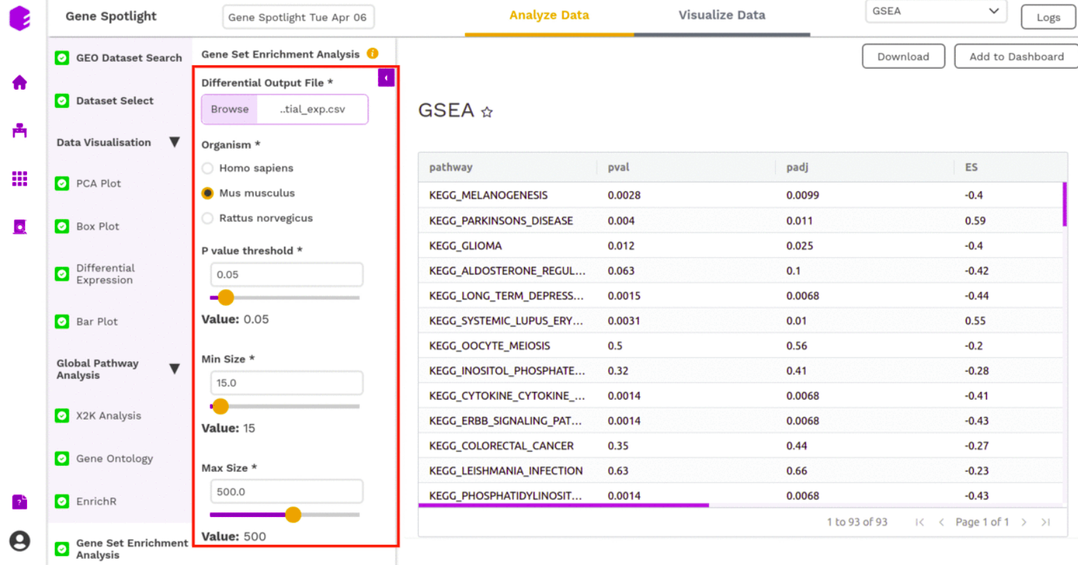
The component will generate the following output-
Dashboard
You can collect your findings (plots) for different modules using different filters into what is called a Dashboard. The Visualization Dashboard provides an at-a-glance view of the selected visualization charts. The dashboard is customizable and can be organized in the most effective way to help you understand complex relationships in your data and can be used to create engaging and easy-to-understand reports.